Radio Button Attributes
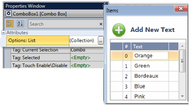
Options: List
|
This list holds the Options that are shown in a User Control. Each Option is assigned an Index Number in the List. To edit the List, click Collection on the right. |
|
Tag: Current Selection
The linked register holds the Index Number of the Option that the end-user selects.
Tag: Selected
Link a bit; this bit turns ON when the end user selects an Option.
The bit stays ON until it is reset by the application.
Tag:Touch Enable/Disable
The Touch property of this element is enabled by
default.
Assign a Touch Enable\ Disable bit to allow you to enable or disable the
element’s Touch property.
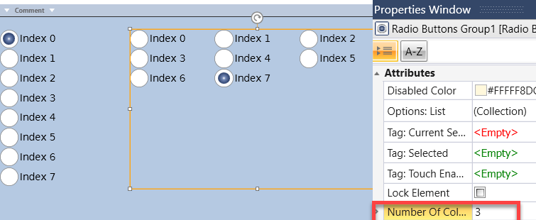
Enter the number of columns, UniLogic will automatically arrange the buttons in Columns. Resize the widget as necessary.
Background Color/Image
Click the drop-down arrow to the right, and then:
|
|

Radio Button Color
Click the drop-down arrow to select a color.
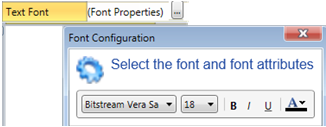
Text Font
Click Font Properties to select a font and style it. To edit the List, click Font Properties on the right. |
|
Text Placement
Places the text to the left or right of an item.