Properties of appearance determine how an HMI Element appears on the screen.
|
Only those properties that are relevant to an element are available in the Properties window.
|
 |
|
Properties |
|
|
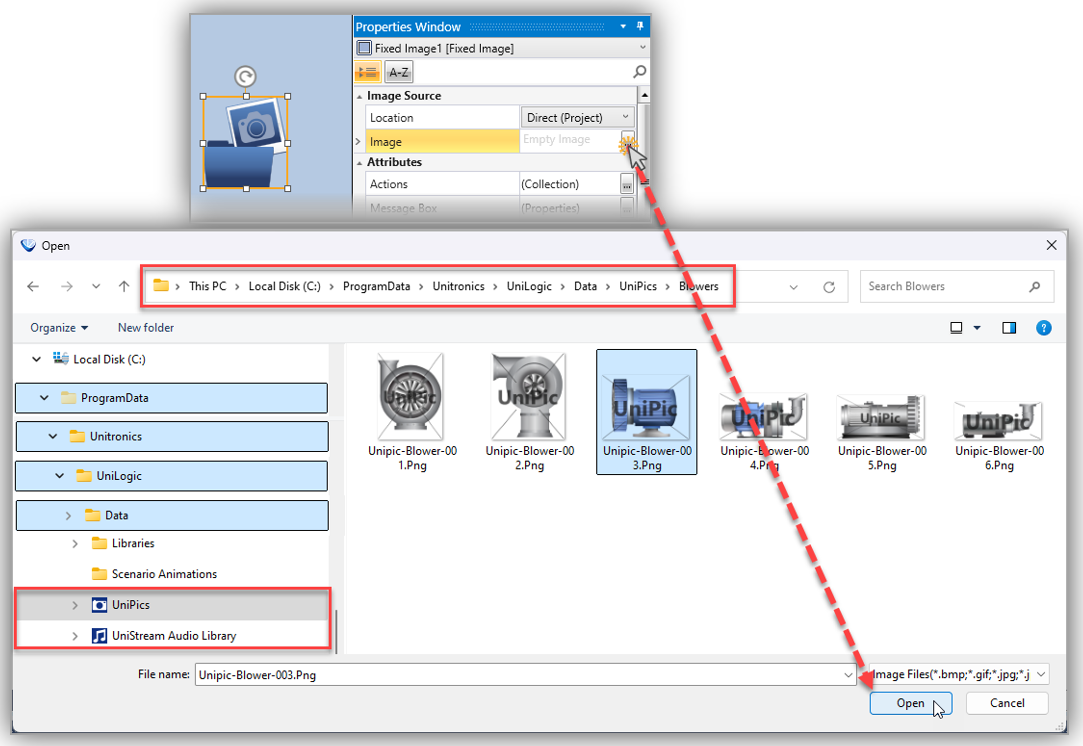
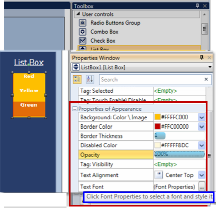
Background Color \Image |
Click the drop-down arrow, and then:
|
|
Background Fill Color |
Click the drop-down arrow to the right to select a color. |
|
Line Thickness |
Range 1-10 pixels To adjust thickness, click the bar to the right, and either:
or
|
|
Border Color |
Click the drop-down arrow and select a color. |
|
Border Brush |
Click the drop-down arrow and select a color. |
|
Border Thickness |
Range: 1-10 pixels To adjust thickness:
or
|
|
Opacity |
Range 1-100% To adjust opacity / transparency, click the bar to the right, and either:
or
|
|
Tag: Visibility |
To control element visibility via Bit:
|
|
Text Alignment |
The default alignment centers the text horizontally and vertically within the element. To change the alignment, click the drop-down arrow on the right and select the desired position. |
|
Text Font |
Click Font Properties to select a font and style it. |
|
Text Placement |
Places the text to the left or right of an item. |