Combo Attributes
This defines where and how the list of options is sourced. It determines whether the combo box options are static (defined at configuration time) or dynamic (pulled from PLC memory or tags at runtime).
| Direct: You manually enter fixed text options | 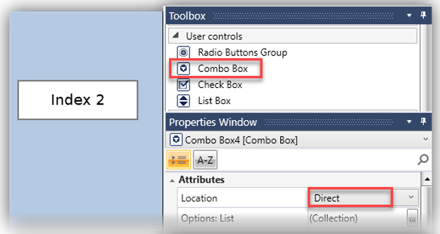 |
| Indirect: You reference tags that point to predefined lists via path to items that are hosted on the SD card or on a DOK (USB stick). | 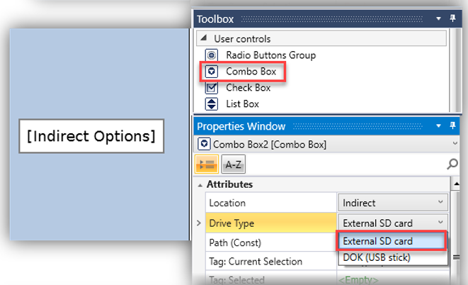 |
| Dynamic: You can enter String Tags, Const Strings, or Const Tags to populate the list dynamically. | 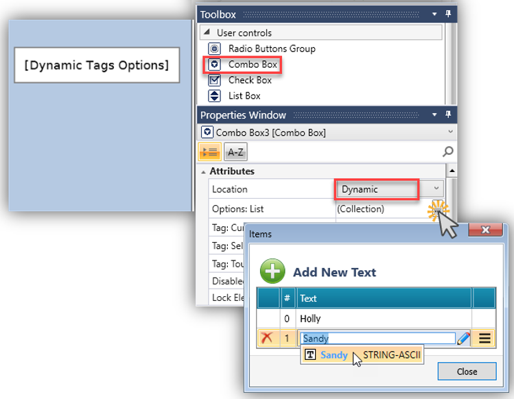 |
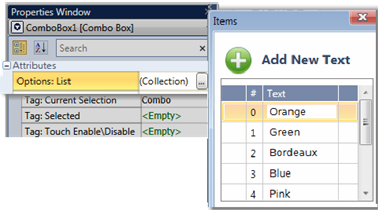
Options: List
|
This list holds the Options that are shown in a User Control. Each Option is assigned an Index Number in the List. To edit the List, click Collection on the right. |
|
Tag: Current Selection
The linked register holds the Index Number of the Option that the end-user selects.
Tag: Selected
Link a bit; this bit turns ON when the end user selects an Option.
The bit stays ON until it is reset by the application.
Tag:Touch Enable/Disable
The Touch property of this element is enabled by
default.
Assign a Touch Enable\ Disable bit to allow you to enable or disable the
element’s Touch property.
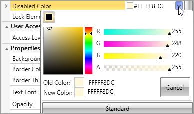
Disabled Color
The Disabled Color is applied to an element when the Touch Control bit is OFF. To modify the default color, click the drop-down arrow located on the right side and select your preferred color.
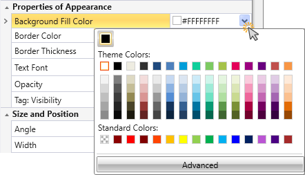
Background Fill Color
Click the drop-down arrow to the right to select a color.
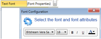
Text Font
Click Font Properties to select a font and style it. To edit the List, click Font Properties on the right. |
|