Combo Attributes
CheckMark Color
This sets the color of the CheckMark.
CheckMark Size
Use this to set the CheckMark size to match the size of the text font.
CheckMark Text
This is the text that is displayed within the element.
The length of the text string cannot exceed the width of the element.
Tag: Selected
Link a bit; this bit turns ON when the end user selects an Option.
The bit stays ON until it is reset by the application.
Tag:Touch Enable/Disable
The Touch property of this element is enabled by
default.
Assign a Touch Enable\ Disable bit to allow you to enable or disable the
element’s Touch property.
Background Color/Image
Click the drop-down arrow to the right, and then:
|
|

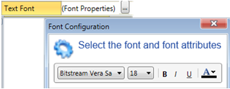
Text Font
Click Font Properties to select a font and style it. To edit the List, click Font Properties on the right. |
|