You can control the Touch property of an element via the Touch Enable\ Disable Bit.
Buttons are available in different shapes. Apart from the shape, the button parameters and features are identical.
Touching a Button can activate one or more events, according to the definitions in the Actions property.
|
You can control the Touch property of an element via the Touch Enable\ Disable Bit. Buttons are available in different shapes. Apart from the shape, the button parameters and features are identical. |
|
|
Button Attributes |
|||
|
Actions |
Actions enable a single Touch Element to trigger multiple events. Multiple bits can be linked to one element, triggering Load screen, set, reset, and toggle bits, and more. To create an action:
|
||
|
Message Box |
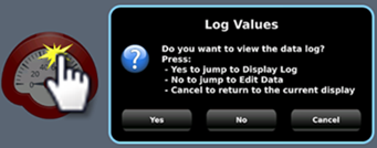
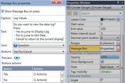
Elements that offer actions also allow you to show users a Message Box, a popup message that opens when the user touches the element.
The message can ask the user a question, or give instructions and warnings. You can select icons, include buttons in the Message Box and use the buttons to drive actions.
|
||
|
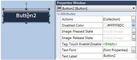
Disabled Color |
The Disabled Color is applied to an element when the Touch Property Control bit is OFF. To change the default color, click the drop-down arrow on the right and select a color. |
||
|
Image: Pressed State |
When the element is pressed, this image fills the element for as long
as pressure is applied.
|
||
|
Image: Released State |
This image fills the element when it is not in a Pressed state.
|
||
|
Style |
Use the drop-down arrow to select a different button shape. |
||
|
Tag:Touch Enable/Disable |
The Touch property of this element is enabled by
default. |
||
|
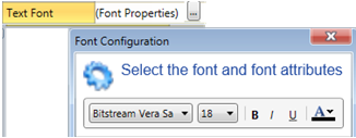
Text Font |
|
||
|
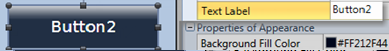
Text Label |
|
||
|
Text Placement |
Places the text to the left or right of an item. |
||
General Properties
HMI Elements: Properties of Appearance
HMI Elements: Size and Position