Data sampling enables you to record data, such as output values, at fixed intervals into files on an SD card. A Data Sample can contain a number of feeds.You can define multiple Data Samples.
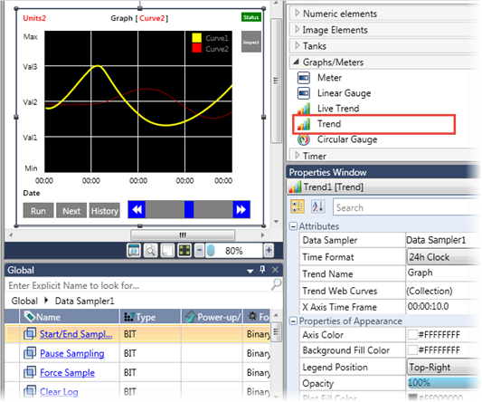
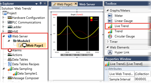
You can also represent Data Samples as Trend graphs on the HMI screen.
Note that when you create a Data Sample, UniLogic creates a struct to enable you to control its functions.
|
Property Name
|
Definition
|
|
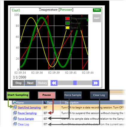
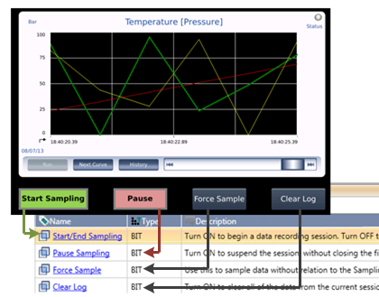
Start/End Sampling
|
Turn ON to begin a data recording session. Turn OFF to stop the session, close the file, and save it to SD card.
The PLC saves the file with a timestamp. The timestamp provides the date and time that the file closed (bit=OFF).
|
|
Pause Sampling
|
Turn ON to suspend the session, without closing the file. Turn Off to resume sampling.
|
|
Force Sample
|
Use this to sample data without relation to the Sampling Interval. Reset by the OS.
|
|
Clear Log
|
Turn ON to clear all of the data from the current session.
|
|
Status
|
0 = No Error
-1 = SD card not found
-2 = Reserved for internal use
-3 = Save File Error (File name may contain illegal characters)
|
|
Sampling Interval
|
Read-only. This parameter is defined in the Data Sampler Properties.
|
|
Missed Sample Bit
|
Turns ON if no Data Sample has been made during 2 Sampling Interval times. Reset by user.
|
|
Missed Sample Counter
|
Increments each time the Missed Sample Bit turns ON.
|
|
Samples Count
|
Read-only. This is the number of times the data is sampled during the session.
|
|
User Comment 1
|
The user can add comments (strings), such as Batch #; these are saved as part of the data file on the SD card.
|
|
User Comment 2
|
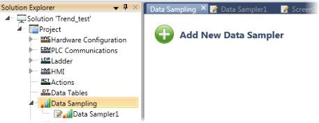
Defining a Data Sample
-
Open Data Sampling from the Solution Explorer tree.
-
Click Add New Data Sample.
-
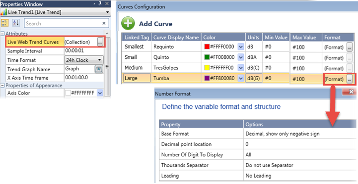
Define the  Properties for this Data Sampler.
|
Property Name
|
Definition
|
|
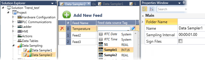
Folder Name
|
Click the field to assign a folder name. The application will create a folder of this name on the SD card to store the Data Sampler files.
|
|
Name
|
This is the reference name of the Data Sampler object.
|
|
Sampling Interval
|
This determines the time between data samples.
|
-
Add data Feeds: click Add New Feed, and then define the Feed Data Source Tag.
Note that you can change the default Feed Name by clicking the field and editing it.
Sampling Data
Use the members of the Data Sampler Struct: Start/End Sampling, Pause Sampling, and Force Sampling tags in your Ladder to control the sampling process.
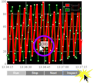
In the image below, a Data Sampler is displayed as a Trend graph. The HMI buttons under the Trend are linked to the Data Sampler struct.