Use the Slider widgets to display and to edit a variable value. The user can modify the value in the linked tag by touching and moving the slider on the screen.
Sliders are available in different shapes and styles.
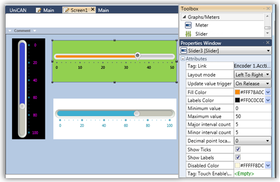
Use the Slider properties to customize its values and appearance.
|
Gauge Attributes |
|
|
Tag Link |
The value of this tag is represented by the Slider. |
|
Layout Mode |
This determines the direction of the slider. |
| Update Value Trigger | When the user moves the slider, this determines whether the value updates during the move, or only when the user lifts his finger after completing the motion. |
|
Fill Color |
Select the fill color. |
|
Labels Color |
Select the color of the numbers. |
|
Minimum Value Maximum Value |
These set the Slider range. The Minimum and Maximum values may be provided via data tag, or may be a constant value. |
|
Major interval count |
Set the value of the major range ticks. |
|
Minor interval count |
Set the value of the minor range ticks. |
|
Decimal point location |
Use this to include and place decimal points in the gauge tick values. |
| Show Ticks | When this is checked, ticks are displayed in between the numbers. |
|
Show Labels |
When this is checked, the numbers are shown. |
|
Preserve Margins |
This is checked by default; uncheck if you wish to decrease the padding around the slider. |
|
Tag:Touch Enable/Disable |
The Touch property of this element is enabled by
default. |
| Disabled Color |
The Disabled Color is applied to an element when the Touch Property Control bit is OFF. To change the default color, click the drop-down arrow on the right and select a color. |
|
Background Color |
Click the drop-down arrow to open the color palette and select a fill color for the slider. |