Use the Gauge widgets to display a variable value.
There are three main types of HMI Gauge widgets.
Linear Gauge - A visual indicator used to display data based on a predefined range, resembling a thermometer.
Dynamic Linear Gauge - An advanced real-time visual indicator that dynamically calculates and adjusts tick marks based on changing temperature values.
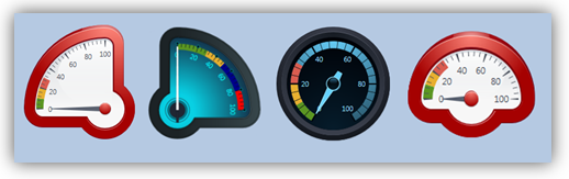
Circular Gauge - A visual indicator used to display data within a circular or semi-circular dial.
Circular Gauges are available in different shapes and styles.
|
Use the gauge properties to customize the values and appearance of the gauge. |
|
|
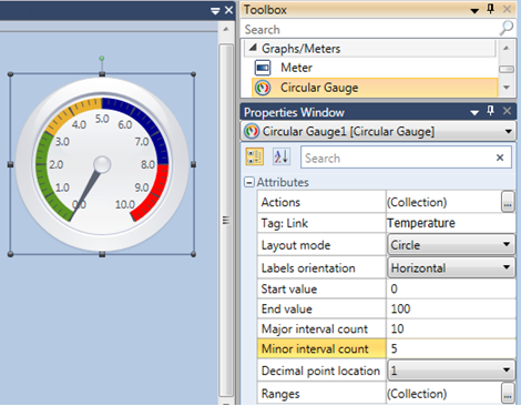
Gauge Attributes |
|
|
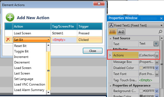
Actions |
Actions enable a single Touch Element to trigger multiple events. Multiple bits can be linked to one element, triggering Load screen, set, reset, and toggle bits, and more. To create an action:
|
|
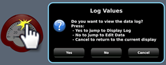
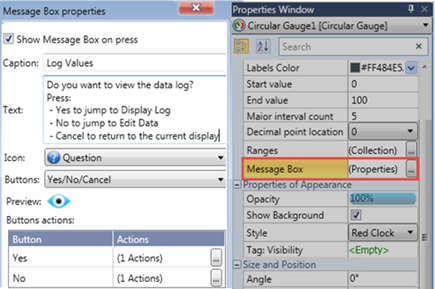
Message Box |
Elements that offer actions also allow you to show users a Message Box, a popup message that opens when the user touches the element.
The message can ask the user a question, or give instructions and warnings. You can select icons, include buttons in the Message Box and use the buttons to drive actions.
|
|
Tag Link |
The value of this tag will be represented by the gauge. |
|
Layout mode |
Choose the shape of the gauge. |
|
Labels Orientation |
This determines the position of the text relative to the gauge ticks. |
|
Start/End Value |
Set the gauge range. |
|
Major interval count |
Set the value of the major range ticks. |
|
Minor interval count |
Set the value of the minor range ticks. |
|
Decimal point location |
Use this to include and place decimal points in the gauge tick values. |
|
Ranges |
This enables you to set ranges and assign colors to the ranges displayed on the gauge. |