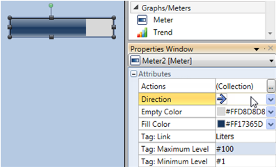
You can select the fill direction via the Direction dropdown list.
Use the Graph widgets to display a variable value.
|
You can select the fill direction via the Direction dropdown list. |
|
|
Graph Attributes |
|
|
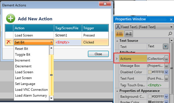
Actions |
Actions enable a single Touch Element to trigger multiple events. Multiple bits can be linked to one element, triggering Load screen, set, reset, and toggle bits, and more. To create an action:
|
|
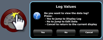
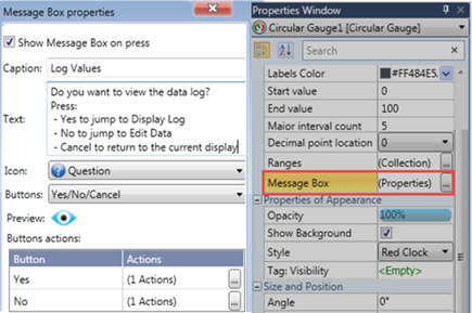
Message Box |
Elements that offer actions also allow you to show users a Message Box, a popup message that opens when the user touches the element.
The message can ask the user a question, or give instructions and warnings. You can select icons, include buttons in the Message Box and use the buttons to drive actions.
|
|
Empty Color |
Select a color for the empty graph. |
|
Fill Color |
Select the fill color. |
|
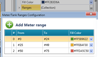
Ranges |
If you select a solid fill color, you can link ranges to colors.
|
|
Tag: Maximum Level Tag: Minimum Level |
The Minimum and Maximum values may be provided via data tag, or may be a constant value. Maximum represents the filled state, Minimum the empty state. |
|
Direction |
Use the drop-down arrow to select a fill direction. |
|
Tag:Touch Enable/Disable |
The Touch property of this element is enabled by
default. |